5 Reasons Your Landing Page Doesn’t Convert [Checklist]
Table of Contents
Introduction
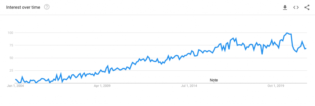
A well-designed landing page is a flagship feature of every successful digital marketing campaign. Interest in landing pages is growing for a good reason – in fact, the number of online searches for “Landing Pages” has seen aggressive growth over the last few years.
A well-executed landing page is essential for taking the visitors who have already shown interest in your campaign and pushing them that final extra step towards conversion. If your existing landing page doesn’t deliver, it means you’re letting sales slip through your fingers – and it’s time to change that.
In this article, we’ll share some common landing page mistakes and the key improvements you can make right now to strengthen the performance of your pages.
Why your landing page doesn’t convert?
1. Your customers don’t understand your product.
By definition, landing pages act as destination pages your customers land on from a particular campaign.
Suppose you’re running a PPC campaign to increase software sign-ups. In that case, your landing page content should concentrate on that specific piece of software, its benefits and the value it brings to the potential customer. This can be quite a bit of information.
At the same time, your landing page content should be concise and straight to the point. The real question is how you can achieve both of those goals while keeping your prospects engaged?
First things first, you need to lay out a clear hierarchy of product information to create a message that is easy to digest, but complex enough to demonstrate your value.
For example, if your goal is to drive new customers to try your SaaS product, you should showcase its headline benefit front and centre, then go into the more detailed core features and then the key challenges it solves to make your prospects’ lives better. This eases visitors in gradually and helps them to make an informed decision of whether to sign up.
To make sure that your prospects learn as much as possible during their first visit, you could use an explainer video.
According to Eye View Digital, using the right video content on your landing page could increase conversions by as much as 86%, and this holds true for a couple of reasons.
First, people hate reading long copies.
When people are landing on your website from a paid campaign, they are already at a different stage of the sales cycle (think the bottom of the funnel) rather than people visiting your blog. If at this point, you serve them with more technical, information-dense copy, chances are they will drop off – and you will lose your precious marketing budget on driving traffic that doesn’t convert.
Second, animation can help to illustrate even the most complex ideas and technologies.
By using product explainer videos on your landing page, you’ll be able to demonstrate your product in action. Animation creates a story that puts your customer right in the heart of it.
Think about advanced IT solutions such as blockchain or cloud-based systems – how hard would it be to understand the technology underpinning them without visualising it?
Read more about how you can grow your SaaS business.
2. You ask for too much information.
Some landing pages have the sole purpose of collecting information about your potential customers to fuel the sales pipeline.
If you’ve already created an outstanding landing page, but for some reason, it fails to attract a decent number of conversions, it might be because your contact form is too long to fill.
Data presented by Quicksprout shows that limiting the number of contact form fields to just three can guarantee a minimum conversion rate of 25%.
This is an important consideration, especially in B2B marketing, where prospects are often busy evaluating different options, and they might simply rush through a lengthy form, decreasing the quality of data submitted. So if you ask them for too much information at once, chances are they’ll drop off before completing the form.
If you run a campaign to promote your latest ebook, think about the number of fields you really need your prospect to fill in.
Do you need their full address or company’s size at this stage? With gated content, the best practice is collecting names and email addresses only and using your marketing automation software to collect more data as the journey continues. You might know this as progressive profiling.
Another issue with overly complex forms is their performance on mobile devices. If your contact form already looks complicated on desktop, it will look even worse on mobile. Just put yourself in the shoes of your customer – how frustrating would it be for you to scroll through a never-ending form?
3. Your landing page copy doesn’t reflect your ad.
When people visit your website from a paid campaign, it’s mainly because they liked your ad. To keep the momentum going and convert your website visitors into paid customers, your site has to reflect the value proposition you’ve specified in your ad.
To increase the conversion rate, you should show consistency between your ad’s message and your landing page content.
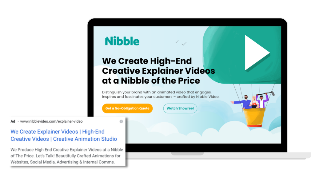
For example, if you run a campaign offering marketing services in Surrey, you have to create landing pages that focus exclusively on marketing in Surrey.
If you run the campaign in other parts of the UK, you should always customise your campaign assets to meet different criteria such as the location or services offered. No one will convert if they clicked on an ad for animated video production in Camberley, and they’ve been redirected to a generic landing page offering marketing services in Bristol – even if video production is one of the services offered.
According to HubSpot, 55% of visitors spend fewer than 15 seconds on your website. Therefore, if you don’t provide them with tailored content that reflects their search intent, chances are you’re going to lose them at the spot!
4. Your landing page focuses on more than one offer.
Similar to locations and services, each landing page should focus on one offer.
Landing pages are often built away from the main site’s navigation because they deliver a distraction-free environment that helps your customer decide whether your product is a good fit for them.
Landing pages perform better when compared to a generic product page because they can exclusively target one specific challenge your customer is facing.
Brand24, a media monitoring tool from Poland, does an excellent job of optimising their landing page to ensure it solves their client’s challenges.
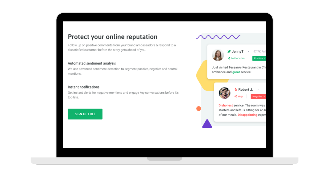
If your paid campaign directed your prospect to the homepage of your website with no clear offer or USP, your customers would drop off immediately as it’s unlikely that they’ll be willing to discover your proposition on their own.
To optimise your visitor’s experience, your landing page content must always focus on one offer.
For example, if you’re providing digital marketing services, it might be worth breaking down your offer to individual disciplines to align with your prospect’s specific needs, such as PPC or SEO. You can then create a set of landing pages, with each of them focussing on a particular service.
5. You don’t A/B test.
Although there is no one-size-fits-all formula for successful landing pages, you can increase your site’s performance by carrying out regular A/B tests and experiments.
Testing is an integral part of all digital marketing efforts. This is especially true for landing pages, which play a crucial role in your paid campaign success.
The most popular A/B tests include testing alternate headlines, tweaking copy and using different images.
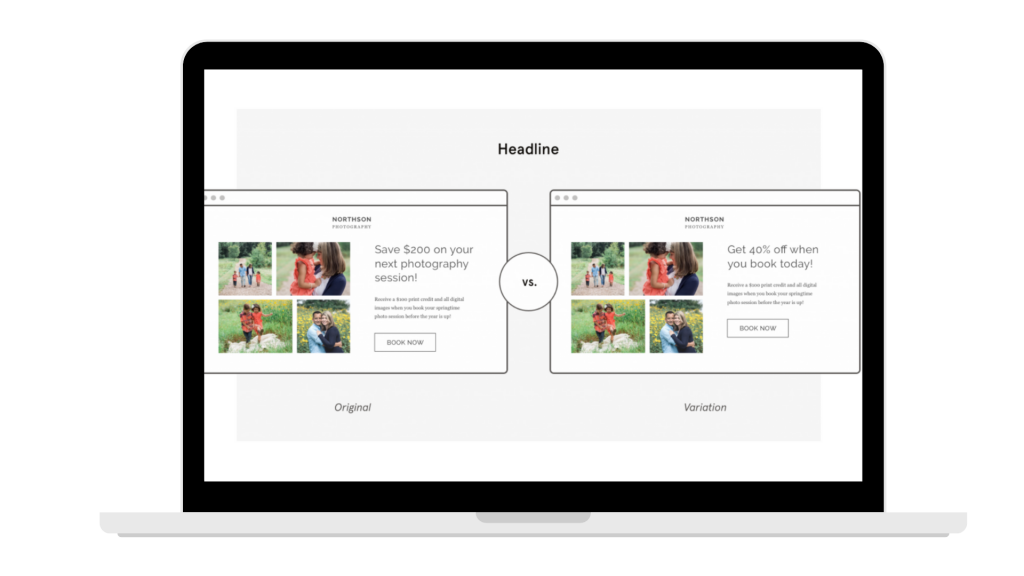
Free tools such as Google Optimize or HotJar are an excellent way to start with A/B testing as they will help you reveal insights about your customers and what kinds of different content resonates with them.
Combining Google Optimize and HotJar allows you to track all critical metrics needed to ensure your digital success. These metrics include conversion rate improvement rates (to help you decide on the best headlines), record the on-site user journey (to inform UX improvements) or create heatmaps (to understand how website visitors consume your content).
With an ongoing test-and-learn approach, you’ll always be improving your landing pages little by little and slowly optimising the valuable traffic you attract to your site.
If you’re looking for creative content to help you convert more website visitors, give us a shout. At Nibble, we offer bespoke animation production services for businesses of all sizes, helping you to tell a story that sells.
